
News
The Ultimate Guide: How to Choose the Perfect Light Color Temperature for Every Room in Your Home
Sep
Have you ever walked into a room and felt an instant sense of calm and relaxation? Or, conversely, have you entered a space that felt harsh, sterile, and unwelcoming, without being able to pinpoint exactly why? The answer might not be in the furniture or the paint color, but rather hanging right above your head. The power of lighting is one of the most underestimated yet impactful elements of interior design. It dictates mood, influences productivity, and can transform a simple house into a warm, inviting home. Yet, for many, choosing a light bulb is an afterthought, often boiling down to a quick grab-and-go decision at the hardware store based on wattage or brightness alone. This common oversight ignores the most crucial factor in creating ambiance: color temperature.
Understanding how to choose the right light color temperature is the secret to unlocking the full potential of your home’s design. It’s the difference between a kitchen that feels energetic and clean, and one that feels like a clinical laboratory. It’s the key to a bedroom that serves as a true sanctuary for rest, rather than a space that keeps your mind buzzing. The light we live under has a profound effect on our psychology and even our biology, influencing our energy levels, our ability to concentrate, and our natural sleep cycles. This guide is designed to demystify the world of lighting and empower you to make intentional, informed choices. We will move beyond the confusing jargon and technical specifications to provide a clear, room-by-room roadmap. By the end, you will not only understand the difference between warm, neutral, and cool light but also know precisely how to wield this knowledge to craft the perfect atmosphere for every single area of your home, ensuring your living spaces look and feel exactly the way you want them to.
Part 1: Decoding the Science of Light – Kelvin, Lumens, and CRI
Before we can begin assigning the perfect light to each room, it’s essential to understand the basic language of lighting. For years, the only metric most people considered was the watt, which is actually a measure of energy consumption, not brightness. With the advent of energy-efficient LEDs, the game has changed. Let’s break down the three most important terms you’ll see on lighting packaging today.
What is Color Temperature (The Kelvin Scale)?
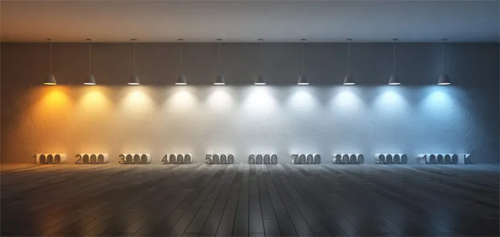
This is the heart of our discussion. Color temperature refers to the appearance of light, from warm to cool, and is measured on the Kelvin scale (K). The concept can be a bit counterintuitive at first: the lower the Kelvin number, the warmer and more yellow/orange the light appears. The higher the Kelvin number, the cooler and more blue the light becomes.
Think of it like heating a piece of metal. At first, it glows a deep red, then orange, then yellow. As it gets hotter and hotter, its glow becomes a brilliant white and eventually a piercing blue-white. The Kelvin scale works in the same way, describing the color of the light, not its actual heat output.
Here is a simple breakdown of the most common ranges for home lighting:
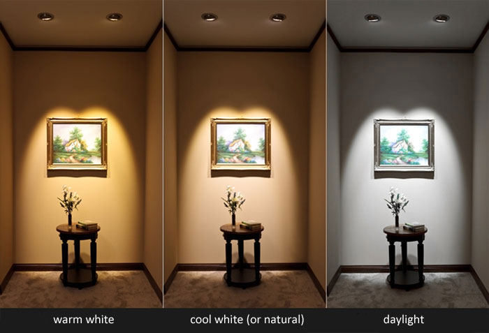
- Warm White (2000K – 3000K): This is the color of a traditional incandescent bulb, a candle flame, or a sunset. It casts a soft, cozy, and inviting yellow-orange glow. It’s perfect for creating a relaxing and intimate atmosphere. It makes people feel at ease and is flattering to skin tones.
- Neutral or Natural White (3100K – 4500K): This range strikes a balance between warm and cool tones. It provides a clean, bright, and vibrant light that is closer to natural daylight. It’s excellent for spaces where you need clarity and focus without the harshness of a cool white bulb. It renders colors more accurately than warm light.
- Cool White or Daylight (4600K – 6500K+): This light appears crisp, bright, and has a distinctly blueish tint, similar to daylight on an overcast day or the light in a commercial setting. It is highly energizing and promotes alertness and concentration. However, if used improperly, it can feel sterile, clinical, or even jarring in a home environment.
Beyond Kelvin: Lumens vs. Watts
For decades, we were taught to associate watts with brightness. A 100-watt bulb was brighter than a 60-watt bulb. That logic is now outdated. Watts measure the amount of energy a bulb consumes. With highly efficient technologies like LEDs, a bulb can produce a lot of light while consuming very little energy.
The true measure of brightness is the lumen. The higher the lumen count, the brighter the light will be. When you are shopping for a new bulb, you should first decide on the color temperature (Kelvin) you need, and then look at the lumens to determine the required brightness for your space. For example, a standard 60-watt incandescent bulb produces about 800 lumens. Its LED equivalent might only consume 8 to 10 watts to produce the same 800 lumens of light. Always prioritize lumens for brightness, not watts.
A Quick Note on CRI (Color Rendering Index)
The Color Rendering Index (CRI) is a scale from 0 to 100 that measures how accurately a light source reveals the true colors of objects, people, and surroundings compared to natural sunlight. A light source with a low CRI will make colors appear washed out, dull, or even shift their hue.
For home use, you should always aim for a bulb with a CRI of 90 or higher. This is especially important in areas where color accuracy is key, such as the kitchen (judging the freshness of food), the bathroom (applying makeup), or near artwork. A high CRI ensures that the colors in your home—from your wall paint to your furniture and even your food—look vibrant and exactly as they were intended.
Part 2: The Psychology of Light – How Color Temperature Affects Mood and Biology
The choice between a 2700K bulb and a 5000K bulb is about much more than aesthetics; it directly impacts your psychological and physiological state. Our bodies have an ancient, hardwired response to the color of light, conditioned by millennia of living by the sun’s cycle.
Warm light, with its golden and amber tones, mimics the light of sunrise and sunset. These are times our brains naturally associate with winding down or gently waking up. This color temperature triggers a sense of comfort, security, and relaxation. It can make a large, open space feel cozier and more intimate, encouraging conversation and connection. This is why high-end restaurants, cozy cafes, and hotel lobbies almost exclusively use warm lighting—they want their patrons to relax, linger, and feel comfortable.
On the other end of the spectrum, cool light mimics the bright, intense light of the midday sun. This type of light is rich in blue wavelengths, which our brains interpret as a signal to be awake, alert, and productive. It can increase focus, enhance concentration, and even boost our energy levels. This makes it ideal for task-oriented environments like an office, a workshop, or a commercial kitchen. However, this same stimulating effect can be a major disadvantage in the wrong context.
This leads to the critical concept of the circadian rhythm, our body’s internal 24-hour clock that regulates sleep-wake cycles. This rhythm is heavily influenced by light exposure. The blue light present in cool white bulbs (4600K and above) is particularly effective at suppressing the production of melatonin, the hormone that tells our body it’s time to sleep. Exposure to this type of light in the evening can disrupt our circadian rhythm, making it harder to fall asleep and reducing the quality of our rest. Conversely, the low blue-light content of warm lighting has a minimal effect on melatonin, making it the perfect choice for evening and pre-bedtime routines. Understanding this biological connection is fundamental to designing a lighting scheme that not only looks good but also promotes well-being.
Part 3: A Room-by-Room Guide to Choosing Light Color Temperature
Now, let’s apply this knowledge and walk through the main areas of a home. We will focus on layering different types of light—ambient (overall illumination), task (for specific activities), and accent (to highlight features)—to create a space that is both beautiful and functional.
The Living Room: The Hub of Comfort and Versatility
The living room is arguably the most multi-functional space in the home. It’s where you relax, entertain guests, watch movies, and maybe even read a book. The lighting here needs to be flexible enough to accommodate all these activities.
- Primary Goal: Create a warm, welcoming, and relaxing atmosphere.
- Recommended Color Temperature: 2700K Warm White for most applications.
- Ambient Lighting: For ceiling fixtures, recessed lights, and chandeliers, a 2700K bulb is the gold standard. It provides a comfortable, golden glow that makes the space feel inviting and is universally flattering.
- Task Lighting: For reading lamps next to a sofa or armchair, you can stick with 2700K for consistency or go up to 3000K if you prefer a slightly crisper light for reading that is still warm.
- Pro-Tip: The single best investment for living room lighting is a dimmer switch. Being able to adjust the brightness (lumens) allows you to transition the mood seamlessly from a bright, social gathering to a cozy, intimate movie night, all while maintaining that warm color temperature. Smart bulbs that allow you to change both brightness and color temperature offer the ultimate in flexibility.
The Kitchen: The Domain of Functionality and Cleanliness
The kitchen is a workspace first and foremost. Here, visibility, cleanliness, and energy are the top priorities. The wrong lighting can make food prep difficult and even unsafe.
- Primary Goal: Bright, clear light for tasks, ensuring the space feels clean and energetic.
- Recommended Color Temperature: 3000K to 4000K Neutral White.
- Ambient Lighting: For the main overhead lights, a 3000K bulb provides a good balance. It’s bright and clean without feeling too sterile.
- Task Lighting: This is crucial in the kitchen. For under-cabinet lighting that illuminates your countertops, a brighter and cooler 4000K Neutral White is ideal. This color temperature renders the colors of your food accurately, making it easy to see what you’re doing when chopping vegetables or reading a recipe. It provides high clarity without the harsh blue tones of a 5000K bulb.
- Accent/Decorative Lighting: For pendant lights over a kitchen island or a dining nook, you can use a warmer 2700K or 3000K to create a more intimate and distinct zone for dining and socializing, separating it from the “work” areas of the kitchen. A high CRI of 90+ is non-negotiable in the kitchen.
The Bedroom: Your Sanctuary for Rest and Relaxation
The bedroom’s primary function is rest. All lighting choices should support this goal and promote a healthy sleep cycle. This is the one room where cool-toned lights should be strictly avoided.
- Primary Goal: Create a calm, serene, and sleep-conducive environment.
- Recommended Color Temperature: 2700K Warm White or even warmer.
- Ambient Lighting: The main ceiling fixture should be fitted with a dimmable 2700K bulb. Keeping the light soft and warm in the evening signals to your body that it’s time to wind down.
- Task Lighting: Bedside lamps for reading should also be warm, ideally 2200K to 2700K. Avoid bright, cool-toned reading lights that can stimulate your brain right before you try to sleep. The closet is an exception; a small 3000K or 4000K motion-activated light can be helpful for accurately seeing clothing colors without affecting the overall warm ambiance of the room.
- Avoid: Steer clear of any bulbs labeled “Daylight” or anything above 3000K. The blue light they emit can interfere with melatonin production and disrupt your sleep.
The Bathroom: A Space for Grooming and Relaxation
The bathroom presents a unique challenge, as it serves two opposing functions: a bright, functional space for grooming in the morning and a relaxing, spa-like retreat in the evening.
- Primary Goal: Provide accurate, shadow-free light for tasks while also allowing for a relaxing mood.
- Recommended Color Temperature: 3000K to 4000K Neutral White for task lighting.
- Task Lighting (Vanity): This is the most important light in the bathroom. The lights around the mirror should be 3000K or 4000K with a high CRI (90+). This range provides the most accurate color rendering for skin tones, making tasks like applying makeup, shaving, or styling hair much easier. Avoid purely warm or overly cool lights here, as they can make you look sallow or washed out. Place fixtures on either side of the mirror, not directly above, to minimize shadows.
- Ambient Lighting: For the main ceiling light or a light over the shower, you can use a separate, dimmable fixture. A 2700K or 3000K bulb on a dimmer switch is perfect here. You can keep it bright for general use and dim it down to a soft, warm glow for a relaxing bath, effectively creating that spa-like ambiance.
The Home Office: The Zone of Productivity and Focus
Whether it’s a dedicated room or a small corner of your home, the office space requires lighting that minimizes eye strain and maximizes productivity.
- Primary Goal: Promote alertness, focus, and reduce eye fatigue.
- Recommended Color Temperature: 4000K to 5000K Neutral to Cool White.
- Ambient Lighting: The general overhead lighting can be a bright 4000K. This provides a clean, neutral light that’s easy to work in.
- Task Lighting: A dedicated desk lamp is essential. A 4000K or 5000K lamp will provide a crisp, cool light that mimics natural daylight, which has been shown to improve concentration and mood during work hours. Many modern desk lamps are adjustable, allowing you to change both the brightness and the color temperature, which is an excellent feature.
- Consider the View: Try to position your desk to take advantage of natural daylight, and use your artificial lighting to supplement it, matching the color temperature as closely as possible to the light coming from the window to reduce eye strain.
Part 4: Common Mistakes to Avoid When Choosing Light Colors
Navigating the world of lighting can be tricky, and a few common mistakes can easily derail your efforts. Here’s what to watch out for:
- Being Inconsistent: The most jarring mistake is mixing different color temperatures in the same room, especially within the same fixture type. Having one 2700K recessed light and one 4000K recessed light next to it creates a chaotic and unpleasant look. Stick to one color temperature for all your ambient lights within a single space for a cohesive feel.
- Ignoring the Kelvin Scale Entirely: Many people still buy bulbs based on watts or just grab whatever is cheapest. This is the quickest way to end up with a hodgepodge of lighting that doesn’t serve the room’s function or mood. Always check the “Lighting Facts” label for the Kelvin (K) number.
- Going Too Cool in Relaxing Areas: It can be tempting to choose a high-Kelvin “Daylight” bulb because it seems brighter and cleaner. While it has its place in a garage or office, putting a 5000K or 6500K bulb in your living room or bedroom will make the space feel cold, clinical, and completely unwelcoming.
- Forgetting About Dimmers: Installing dimmer switches is a relatively inexpensive upgrade that offers a massive return in terms of functionality and mood control. Not using them is a missed opportunity to add incredible versatility to your lighting scheme.
- Overlooking CRI: A low CRI bulb can make your beautiful interior design look dull and lifeless. Your vibrant red accent wall might look brownish, and your carefully chosen beige sofa might look greenish. Always invest in bulbs with a CRI of 90+ to ensure your colors pop.
Part 5: Layering Light for a Professional Finish
Finally, to truly elevate your home’s lighting, think like a designer by layering your light sources. Relying on a single overhead fixture is what often makes a room feel flat and uninviting. Instead, use a combination of three types of lighting in each room.
- Ambient Light: This is the foundation. It’s the general, overall illumination that allows you to navigate the space safely. This layer comes from ceiling fixtures, chandeliers, or recessed lighting.
- Task Light: This is focused, brighter light for specific activities like reading, cooking, or working. It comes from desk lamps, under-cabinet lights, and vanity lights.
- Accent Light: This is the decorative layer. It’s used to draw attention to specific features, such as artwork, a textured wall, or architectural details. This includes track lighting, picture lights, or spotlights.
By considering the appropriate color temperature for each of these layers, you can create a room that is rich with depth, interest, and functionality. For example, in a living room, you can have 2700K ambient recessed lighting, a 3000K reading lamp by a chair, and a focused 3000K accent light on a piece of art. This strategic use of light adds a professional and polished touch to your home.
Conclusion: Illuminate Your Home with Intention
Lighting is far more than a simple utility; it is one of the most powerful and transformative tools in your design arsenal. It sets the mood, guides the eye, and has a direct impact on your comfort and well-being. By moving beyond the outdated metric of wattage and embracing the crucial concepts of color temperature (Kelvin), brightness (lumens), and color accuracy (CRI), you can begin to make deliberate choices that enhance every single room in your home. The simple act of swapping a harsh, cool-toned bulb in your bedroom for a soft, warm one can radically improve your ability to relax and sleep. The right neutral light in your kitchen can make cooking a more pleasant and efficient experience.
Remember the fundamental principles: warm light (2700K) for relaxation and coziness, neutral light (3000K-4000K) for functional and balanced clarity, and cool light (4000K-5000K) for focus and productivity. Use this knowledge not as a rigid set of rules, but as a flexible framework to craft an environment that truly reflects your lifestyle and needs. The next time you replace a light bulb, you won’t just be making a purchase; you’ll be making a conscious design decision that contributes to the beauty, function, and feel of your personal sanctuary.